


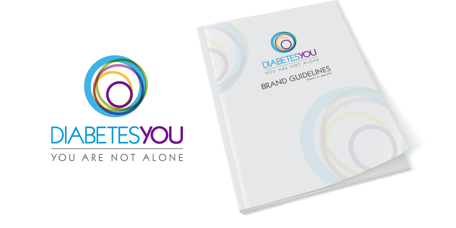
Client: Diabetes You/You Are Not Alone
Objective: To create a logo and brand guidelines marketed towards a diabetes support community.
The Diabetes You logo speaks to three things: Diabetes, Community and the Patient and how they interact with one another. I used colored rings to represent each one. The inner purple ring represents the patient, the yellow ring represents the immediate family, the magenta ring represents close family and friends, the green ring represents other diabetics and support groups and the bold, light blue ring is the symbol for diabetes.
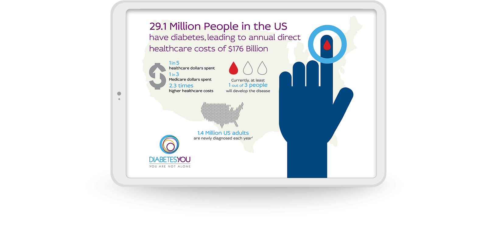
Client: Diabetes You/You Are Not Alone
Objective: To create an info-graphic for a diabetes support community.
The infographic was created and used as key art to show how to use icons for data visualization.
.

Client: Vertex® Portfolio Style Guide
Objective: To demonstrate how to include the branding of Symdeco alongside Vertex's other labels, when they all exist on the same marketing material.

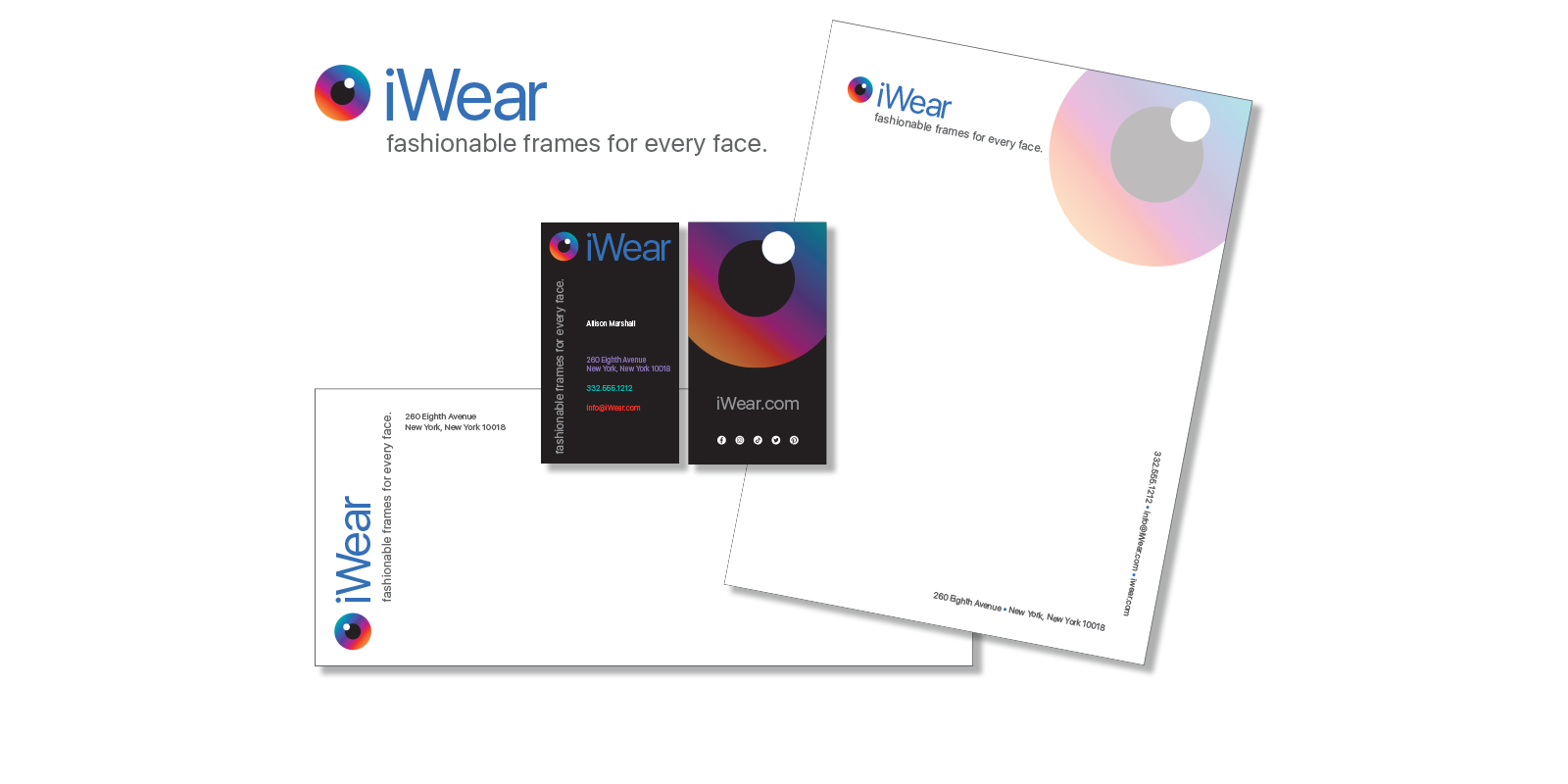
Client: iWear
Objective: To develop the branding for Augmented Reality eyewear company.
I came up with the name iWear as a nod to Apple’s naming convention. It's also the homonym for “eye”. The icon I created uses three circles, arranged to look like an iris. The unconventional use of a vertical arrangement of typography was incorporated to add visual interest.
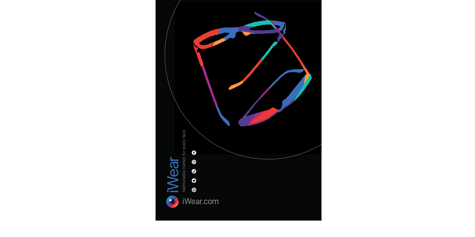
Client: iWear
Objective: To create a retail advertisement.
The eyeglass graphic was created by using the negative space of the eyeglass frames to create a colorful motif. The overlapping frames, vertical typography and repetition of circles, including the use of circular icons for their social media channels, adds another element of interest.
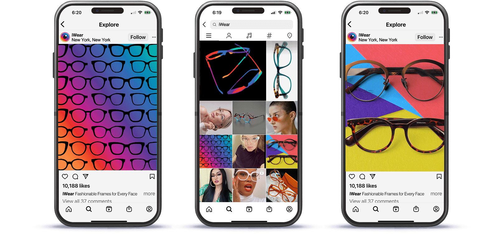
Client: iWear
Objective: To be Social!
Mockup of Instagram posts utilizing brand elements.